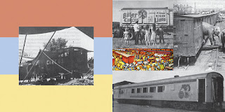
One way of changing this would be to have more than one color square. Each spread would use two colors out of a possible three. I also shrunk down each image on the left page so that the border would have a consistent minimum space.
Using bands instead of squares.
After working up a sequence of using the squares and the bands I lowered the opacity of the colors so that they wouldn't compete with the focus for the main image.
After working and tweaking around with the left page I have found my book to be a lot more cohesive while it better portrays the qualities of a circus.


No comments:
Post a Comment