the taxonomic class within the mollusks, commonly known as snails and slugs.
Showing posts with label color form production. Show all posts
Monday, November 29, 2010
Wednesday, November 3, 2010
Blog Backgrounds
The past couple of work days have been spent working on backgrounds for my blog. I have kept with my 3 tone color palette to keep things simple and orderly. In the end I decided not use a tiled background because they can cause the page to become busy and complicated. Also I found that if a user were to zoom out the tiling would increase and become hectic on the eyes. I tried to work with this by creating tiles that were smaller and larger, but I was unable to find a happy medium since any zooming caused the tiles to change and once again become disorienting. The background that has the multicolored vans became my favorite and if I could lock how big the tiles appeared I would use it.
Monday, October 18, 2010
Blog Changes
Our current lesson in Color, Form, and Production has us working with the aesthetics of our blogs. Areas we are touching on include the headers, the color schemes, and the backgrounds.
My header has changed from a simple text and line header to now including a simple vector image of a person jumping over a van, which of course is a play on my name. The red highlight of the text Jumper is supposed to cause a tie to the red person jumping over the silhouetted bus.
My new backgrounds include a photo background and a tile background made of a squares that is repeated so that it appears to be one large piece.
My header has changed from a simple text and line header to now including a simple vector image of a person jumping over a van, which of course is a play on my name. The red highlight of the text Jumper is supposed to cause a tie to the red person jumping over the silhouetted bus.
My new backgrounds include a photo background and a tile background made of a squares that is repeated so that it appears to be one large piece.
Saturday, September 25, 2010
Color
My completed color star. It has the RBG, CMYK, Hex, and Pantone.
These are color combinations based on theme words. Labeled with names I made up, color scheme, and pantones.
CMYK and Pantone colors based off of an image found on the internet.
Examples from my upcoming book on color relationships.
Wednesday, September 22, 2010
The Emotions of Colors
Colors have emotions and give the viewer different connotations, either positive or negative. Here are the emotions and connotations that these pantone colors make me feel.
bright red 186:
earth brown 438:
bright red 186:
Positive:
Passion
Active
Negative:
Agressive
Hot
vibrant orange1585:
Positive:
Happy
Energetic
Fun
Negative:
None
bright yellow 116:
Positive:
Energetic
Optimistic
Uplifting
Clean
Negative:
feeble (lemons)
Positive:
Stable
Negative:
Dirty
Heavy
Moldy
deep blue 2747:
Positive:
Calm
Negative:
Cold
chartreuse green 584:
Positive:
Soothing
Happy
Fresh
Negative:
None
blue purple 267:
Positive:
Calming
Negative:
Claustrophobic
charcoal gray 425:
Positive:
Calming
versatile
Negative:
Depressed
white:
Positive:
Clean
Open
Safe
Negative:
Empty
Unimaginative
black:
Positive:
Open
Powerful
Negative:
Empty
Heavy
Evil
Sunday, September 19, 2010
Interaction of Color
Studying color is making me realize the different perceptions of color each person has. Every one could have very small perceptual differences that could cause them to see color completely differently. This of course makes the study of color rather complicated as color soon becomes a personal and unique experience. As designers we must learn about the colors, hues, tints, saturations, and shades so that we can maximize the use of color in conveying and expressing what we intended for it to say. This becomes an art of manipulation. There are some rules that govern color that help in learning this color manipulation. Using reversed backgrounds you can cause colors that are the same to either look cooler or warmer. Another helpful tool is the use of color to create spatial relationships. With this a designer would be able to create depth for the viewer to become ensnared in. Another source of color manipulation is the use of colors to change how the viewer sees the color that is being bordered.
Thursday, September 16, 2010
Shell Logo History
The story of the shell logo starts in 1891 when it was used as a marker for kerosene ships in the Far East. Each ship in the fleet was named after a type of shell. This original trading company traded not only oil but trinkets which included pecten shells. In 1904 the shell emblem was added. Since then it has gone through numerous changes. Going from black and white to today's iconic red and yellow. It also started as a rather realistic shell and has since transformed in to a simpler form to reflect todays graphic design trends. The reason the colors were chosen have been long forgotten but speculation suggests that they chose the colors so that the vibrant colors would attract costumers. They also could have been chosen because of the strong Spanish ties that California had with Spain. The shell company says they want their logo to stand for the professionalism and quality that their company offers.
Tuesday, September 14, 2010
Color Craziness
We are finally starting to learn about color. I remember when I first started doing art and wanted to take a color class but soon , after hearing remarks about it being boring, started to dislike the idea of this class. Now that I am actually learning about color Im finding it to be very interesting. the scientificness of it is crazy. A main point of learning color theory is to learn what colors go together. These are called color harmonies. The first one is complementary which is the color that directly across from each other. when next to each other they are very vibrant. Split complementary are a color and the two colors that make up its complementary. It still has the activity but is toned down. Another one is double complimentary, which is a horrible idea to use. It is way too many opposing colors. Analogous is colors that touch each other on the spectrum. This is a static color palette. Tiadic are three color that are evenly spaced within themselves. They oppose each other and are unpleasing. Monochromatic palettes are of just one color.
Thursday, September 9, 2010
Working with Illustrator
Color, Form, and Production has been focusing on the basics of computer work. All of our projects have been dealing with the introduction to Illustrator by Adobe. I have still been working with the Shell logo but I have been given the chance to play around with Illustrator on it and work out how to use the program. I played around with the perspective tool a lot and also tried out some of the effects including bulge and extrude. One of the final and most important processes i learned how to do was after the assignment was over and it was how to crop pieces off, which makes life so much easier now. Using the abilities I have learned in the first two weeks of class I have been using Illustrator to work on designs and templates for Visual Communication. Illustrator gives the ability to quickly make changes which is helpful in the planning stages.


Wednesday, August 25, 2010
Color and Form, Above Ground Underwater Adventures


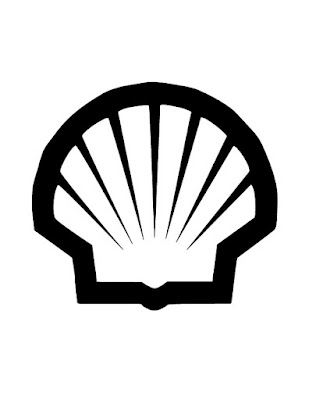
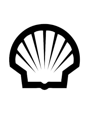
I've been working on my project for Color, Form, and Production tonight. Our first project involves messing around with logos that already exist. I choose to use the shell logo because it was simple and I am still new to illustrator. I have been working with the Pen Tool and Live trace. I'm starting to get used to the Pen Tool, but some of its quirky shenanigans are trying to test me. We had to trace the outside parameter of our logos with the Pen Tool and fill that in with black. We then had to trace to interior space with the Pen Tool and fill it in with white to create our black and white vector versions of our logos.
The second part of the homework was to start over but instead of using the Pen Tool we had to do a live trace. The vector trace that it produced was spot on but I ran into a couple of problems. When I did the live trace the vector image went on top on the template instead of going into the second layer and I cannot figure out how to stop this from happening. Also the live trace made a perfect replica of the logo the first time, so I do not have any points to fix which means I do not have anything to do for the final homework file. The final file was to fix any errors that the live trace made.
The first image included in this post is of the initial Pen Tool outlining Fill. The final Pen Tool and Live Trace images are next to each other to show the differences between the two and to show the progression and process I took.
Subscribe to:
Posts (Atom)


