The reading is about how the Smithsonian brings objects into its collection through a similar process to the artifact research we did for our cultures. Records of the collections are kept to preserve its history. The objects they collect can represent a cultural norm much like our artifacts we collected.
In Making the Invisible Visible the author speaks of his design practices. The topics he stresses are the theme and the concept. He uses his interviews with the client to come up with the theme and concept. Making a list of the words they use most to describe the business he orders them in importance to find the theme. Less important words go to the concept. He then stresses the need to stay on theme and not to wonder away from it so that the project will be successful.

Wednesday, February 9, 2011

Sunday, February 6, 2011


Spectacle! Weaknesses
An area of weakness within my book, Spectacle!, could be my left pages all of which contain only one photo and a colored space around them.


Using bands instead of squares.




One way of changing this would be to have more than one color square. Each spread would use two colors out of a possible three. I also shrunk down each image on the left page so that the border would have a consistent minimum space.


Using bands instead of squares.

After working up a sequence of using the squares and the bands I lowered the opacity of the colors so that they wouldn't compete with the focus for the main image.


After working and tweaking around with the left page I have found my book to be a lot more cohesive while it better portrays the qualities of a circus.
Friday, February 4, 2011
Experimental Type
After reading this article I have been led to believe that experimental type can only be defined by the individual. I find this to be especially true in a field where there are so many people creating in different frames of reference. To have an experiment you have to have something original to go against so that you can see the change and effect. Designers do not all have the same style or background so their experiments might be a everyday practice for different designer. This also becomes aesthetically pleasant as each designer will have their way for doing a specified task. This leads to diversity in graphic design and allows us to learn from each other and our collective experiments.
Thursday, February 3, 2011
Howlin' Wolf
Bio:
Chester Arthur Burnett was born June 10, 1910 in West Point, Mississippi. He died January 10, 1976 in Hines, Illinois. He would beat on pans with a stick and imitate the whistle on trains as a young boy. He would grow to a fearsome 6'3", weigh 275 lbs, and wear size 16 shoes.
Chester Arthur Burnett was born June 10, 1910 in West Point, Mississippi. He died January 10, 1976 in Hines, Illinois. He would beat on pans with a stick and imitate the whistle on trains as a young boy. He would grow to a fearsome 6'3", weigh 275 lbs, and wear size 16 shoes.
His parents separated while he was young and he was left by his mother to his great uncle Will who treated him poorly. He ran away at 13 to rejoin his father who bought him his first guitar in January 1928. He received guitar lessons from Charlie Patton, and harmonica lessons from Sonny Boy Williamson II. He would use a rack-mounted harp to play both instruments simultaneously. He taught himself to sing by listening to records. His mother, who was a street singer, disowned Arthur after he started playing "the devil's music" and wouldn't take any financial help from him. When he wasn't working on his father's farm he traveled around the Delta with musicians such as Sunny Boy, Robert Johnson, Patton, and Son House.
The name Howlin' Wolf stemmed from a story that his great grandfather told him. If he misbehaved the howling wolves would get him.
He recorded songs that became blues standards such as Smokestack Lightning and Killing Floor.
After moving to Chicago, Muddy Waters became his musical rival.
Into the later parts of his life Wolf continued to perform his manic sets in small clubs that had been abandoned by other well-known bluesmen. Of this he said "I sing for the people."
In the late 1960's and early 1970's Wolf suffered several heart attacks and his kidneys were damaged in a car accident. He would continue to perform till the end. His final performance was in November 1975 at the Chicago Amphitheater. He used his usual antics from his early years that included crawling across the stage during the song "Crawling King Snake." After a five minute standing ovation he left the stage and paramedics were called in to revive him.
- 1959: Moanin' in the Moonlight
- 1962: Howlin' Wolf Sings the Blues
- 1962: Howlin' Wolf
- 1964: 'Rockin' The Blues - Live In Germany
- 1966: The Real Folk Blues
- 1966: Live In Cambridge
- 1966: The Super Super Blues Band
- 1967: More Real Folk Blues
- 1969: The Howlin' Wolf Album
- 1971: Message to the Young
- 1971: Going Back Home
- 1971: The London Howlin' Wolf Sessions
- 1972: Live and Cookin' (At Alice's Revisited)
- 1973: Evil - Live at Joe's Place
- 1973: The Back Door Wolf
- 1974: London Revisited
- 1975: Change My Way
- 1997: His Best
Quotes:
"I don't play anything but the blues, but now I could never make no money on nothin' but the blues. That's why I wasn't interested in nothin' else."
"I was just a country boy, glad to get some sounds on wax."
"And that was in '48 when I first started out really to makin' records. But I been playing for 35 years. I was playing long, way before I cut, started to cuttin' records, through-and-out the South.”
"Now listen peoples, everybody say they don’t like the blues. But you wrong. See, the blues come from way back. And I’m gonna tell you somethin’ again. The thing that’s going on today is not the blues, it’s just a good beat that people just carry. But now when you come down to the blues, I’m gonna show you how to play the blues. Now you just sit here and watch me.”
“A lot of people is wonderin’, what is the blues? Well, I’m going to tell you what the blues is. When you aint got no money, you got the blues. When you aint got no money to pay your house rent, you still got the blues. A lot of people holler about ‘I don’t like no blues,’ but when you aint got no money and can’t pay your house rent and can’t buy you no food, you damn sure got the blues.”
“A lot of people is wonderin’, what is the blues? Well, I’m going to tell you what the blues is. When you aint got no money, you got the blues. When you aint got no money to pay your house rent, you still got the blues. A lot of people holler about ‘I don’t like no blues,’ but when you aint got no money and can’t pay your house rent and can’t buy you no food, you damn sure got the blues.”
http://www.howlinwolf.com/
http://depanorama.net/wolf/
http://www.bluesquotes.com/search/label/Howlin%27%20Wolf%20QuotesWednesday, February 2, 2011
More Covers!
The aesthetic of my previous covers have stood out from the rest of my book because the computer generated graphics are too crisp to be paired along side the vintage photos. Jumping from this point I decided to take more inspiration from the vintage circus posters than just their color palettes. Tying this book together means having a cover that is as vintage looking as an original circus poster.
 |
| My first version of this concept was still too digital so I quickly moved on to a new graphic. |
 |
| Having the clown positioned like this made more space to play around with the type but caused to clown to look cramped at the bottom. |
 |
| Moving the clown up created interesting negative space. The type ending at the tip of the hat causes a weird space on the right side. |
 |
| The larger type is aesthetically closer to vintage circus posters and takes care of the awkward space found in the previous version. |
Tuesday, February 1, 2011
Digital Spectacle! Book


Additional Cover Variations.
The first three are color variations of the cover above. Vintage circus posters used slanted type for their designs. While this appears to be kitsch it has become a noticeable feature found in circus related items. The final variation is a more formal, while relying on the typeface for the circus feel.


Wednesday, January 26, 2011
Quote
"Only when the design fails does it draw attention to itself;
when it succeeds, it’s invisible."
This quote by John D. Berry comes from the website creativepro.com where people from design and other closely related fields write articles about design topics. John’s post on March 21, 2007 is titled dot-fonts: Table of Contents and gives a lengthy explanation about good and bad design decisions while creating a table of contents. As a designer that deals mostly with books this is his area of expertise. His main argument during this article is that a table of contents while simple in concept is easily and frequently messed up. This causes problems for the viewer and can cause them to become confused. A good table of contents design allows the viewer to find their way around the page effortlessly and in turn nothing pops out of place. I chose this quote because this is a standard that all designers should aim for. The interaction between the design and the viewer should be as clear and painless as possible.
Link:
http://www.creativepro.com/article/dot-font-tables-of-contents
This quote by John D. Berry comes from the website creativepro.com where people from design and other closely related fields write articles about design topics. John’s post on March 21, 2007 is titled dot-fonts: Table of Contents and gives a lengthy explanation about good and bad design decisions while creating a table of contents. As a designer that deals mostly with books this is his area of expertise. His main argument during this article is that a table of contents while simple in concept is easily and frequently messed up. This causes problems for the viewer and can cause them to become confused. A good table of contents design allows the viewer to find their way around the page effortlessly and in turn nothing pops out of place. I chose this quote because this is a standard that all designers should aim for. The interaction between the design and the viewer should be as clear and painless as possible.
Link:
http://www.creativepro.com/article/dot-font-tables-of-contents
Monday, January 24, 2011
Culture
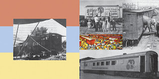
Circus
---
Values
Travel
Excitement
Freedom
Hard Work
Talent
Quirkyness
Materials
Animals
Chair
Whip
Tent
Ringmaster
Podium
Net
Trapeze
Fire Hoops
Clowns
Tightrope
Tiny Cars
Posters
Lion Tamer
Trains
Tribal
---
Values
Family
Hard Work
Survival
Tradition
Cohesion
Strength
Selflessness
Materials
Loin Cloth
Body Modification
Spears
Huts
Blow-darts
Agriculture
Fishing Poles
Chickens
Body Paint
Beads
Small Idols
Shrines
Fire
---
Values
Travel
Excitement
Freedom
Hard Work
Talent
Quirkyness
Materials
Animals
Chair
Whip
Tent
Ringmaster
Podium
Net
Trapeze
Fire Hoops
Clowns
Tightrope
Tiny Cars
Posters
Lion Tamer
Trains
Tribal
---
Values
Family
Hard Work
Survival
Tradition
Cohesion
Strength
Selflessness
Materials
Loin Cloth
Body Modification
Spears
Huts
Blow-darts
Agriculture
Fishing Poles
Chickens
Body Paint
Beads
Small Idols
Shrines
Fire
Wednesday, December 29, 2010
Winter Break Project- The Munny
During last semester I became interested in Kidrobot vinyl designer toys called Dunnys. These are touted as not being toys but as art for ages 15 and up. They are the same basic body shape that Kidrobot then has artists create onto like a canvas. They are then reproduced and sold in blind boxers so the consumer doesn't know which one they are getting. By making some Dunnys more rare than others these items quickly become collector items worth hundreds of dollars.
Kidrobot also makes Munnys, or a do-it-yourself version of the Dunny. This allows for a person to create a highly personalized vinyl piece of art. They come in different sizes ranging from a couple of inches tall to giant 18 inch behemoths. While at a coffee shop that sold Kidrobot merchandise I mentioned them to my sisters, one of which ended up buying me a Munny for Christmas.
The version I got was a 4-inch Christmas Mini Munny that can be hung like an ornament. I ended up removing this hook that screws in. It came with red and green markers, a blank candy cane accessory, and an accessory that appears to be a sign like a person in a picket line would use. None of these included items ended up being used.


At first I was completely baffled on what I should do with this project. The first problem with a project like this is that there are too many options to go with. Limitations needed to be set so a clear and precise idea could be formed. I naturally lean towards simple and clean design, and since Jamie advised me to explore this natural tendency I decided to make this my first limitation on myself. How little could I add while still making an object that is personalized and complete?
I began working on this Munny by researching what others had done with theirs. These blank canvases basically have unlimited potential as people paint them, add on more structure using modeling clay, and use fabric for realistic clothing. The majority of my research brought up Munnys that were pushing the limits of complexity.
My first strong idea was to create a hillbilly. I would add simple black buttons for eyes, paint him flesh color, and I would make him a pair of overalls. These overalls would become the important part of the Munny since they would become the most detailed part. They would show to the audience that the creator, while working simply, was purposefully working this way as a stylistic approach.
The first step was to take the Munny apart and add supports for me to hold on to while painting. Taping the joints was done so that nothing could get on them so the pieces would still fit together. Since vinyl is not the best choice for painting on a primer coat was also necessary. After painting a matte finish was applied to protect the paint from chipping.

The next step was to create the overalls. This began the evolution of this project to its final actualized form. After creating blueprints for the overalls I cut them out of the denim and laid the initial plans over the Munny body. Needing to resize became apparent. After two more iterations of overalls I realized that this plan was being hindered by my lack of experience with creating clothing.
I stopped production to begin rethinking my plans. New plans included a professional boxer or an Olympic swimmer. Going past these juvenile plans I went back to my visual research in hopes of finding something to react to. Once again I noted the complexity in them. I jumped from this overuse of complexity to my new plan that would celebrate the efficiency of simplicity.


Kidrobot also makes Munnys, or a do-it-yourself version of the Dunny. This allows for a person to create a highly personalized vinyl piece of art. They come in different sizes ranging from a couple of inches tall to giant 18 inch behemoths. While at a coffee shop that sold Kidrobot merchandise I mentioned them to my sisters, one of which ended up buying me a Munny for Christmas.
The version I got was a 4-inch Christmas Mini Munny that can be hung like an ornament. I ended up removing this hook that screws in. It came with red and green markers, a blank candy cane accessory, and an accessory that appears to be a sign like a person in a picket line would use. None of these included items ended up being used.


At first I was completely baffled on what I should do with this project. The first problem with a project like this is that there are too many options to go with. Limitations needed to be set so a clear and precise idea could be formed. I naturally lean towards simple and clean design, and since Jamie advised me to explore this natural tendency I decided to make this my first limitation on myself. How little could I add while still making an object that is personalized and complete?
I began working on this Munny by researching what others had done with theirs. These blank canvases basically have unlimited potential as people paint them, add on more structure using modeling clay, and use fabric for realistic clothing. The majority of my research brought up Munnys that were pushing the limits of complexity.
My first strong idea was to create a hillbilly. I would add simple black buttons for eyes, paint him flesh color, and I would make him a pair of overalls. These overalls would become the important part of the Munny since they would become the most detailed part. They would show to the audience that the creator, while working simply, was purposefully working this way as a stylistic approach.
The first step was to take the Munny apart and add supports for me to hold on to while painting. Taping the joints was done so that nothing could get on them so the pieces would still fit together. Since vinyl is not the best choice for painting on a primer coat was also necessary. After painting a matte finish was applied to protect the paint from chipping.

 |
| At home production method for drying. |
The next step was to create the overalls. This began the evolution of this project to its final actualized form. After creating blueprints for the overalls I cut them out of the denim and laid the initial plans over the Munny body. Needing to resize became apparent. After two more iterations of overalls I realized that this plan was being hindered by my lack of experience with creating clothing.
I stopped production to begin rethinking my plans. New plans included a professional boxer or an Olympic swimmer. Going past these juvenile plans I went back to my visual research in hopes of finding something to react to. Once again I noted the complexity in them. I jumped from this overuse of complexity to my new plan that would celebrate the efficiency of simplicity.


Subscribe to:
Posts (Atom)