
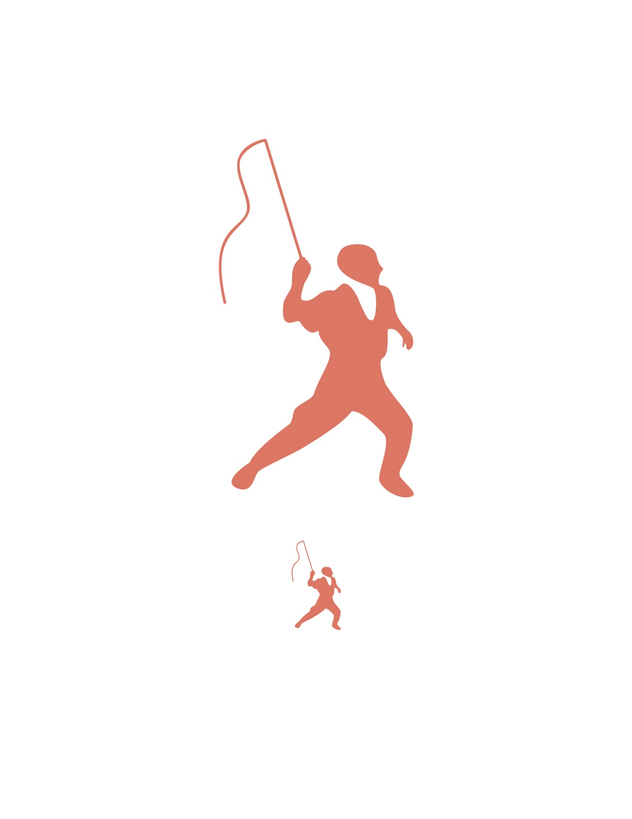
Through this project I have been showing my circus culture in a clean and sophisticated fashion. I am portraying the reality of life in the circus and not the garish, cartoonish design that it is usually seen while visiting the circus as a spectator.
To keep my icons legible I simplified them down to what was needed while keeping certain markers that would clue the viewer into the subject matter. My color choice and placement of color was also used to highlight the important markers in my icons.
Cohesion was kept through my set by setting up rules that I used throughout my icons. All of the icons have an area where the negative space flows into the positive space and adds more detail into the icon itself. Keeping a consistent weight was important so I chose to have all icons be vertical. Directionally I kept all icons facing the right.
2 Color Icon Set:


Single Color Icons:


Progression of the trapeze icon:


No comments:
Post a Comment