Sunday, August 29, 2010

Viscom, DOTs!

What can dots do for you? They can give headaches for one, but they can also demonstrate the principles of design quite nicely too. After viewing the dots as characters in a play it becomes easy to assign them roles in a visual compositions in which they need to convey a certain abstract meaning. This time however we were allowed to use found images to help boost the impact of the dots. After twelve hours, 96 sketches, and 12 compositions Michael Armstrong and I completed our roles as dot art directors. After we were done with our group projects I still had work to do with the original dot compositions I had made. I had to refine an earlier one and then remake it with found images.

Word: Escape
Principle: Proximity


Word: Chaos
Principle: Framing


Word: Spontaneity
Principle: Scale


Word: Cooperation
Principle: Alignment


Word: Pressure
Principle: Framing


Word: Growth
Principle: Scale


Word: Unity
Principle: Compound Shape


Word: Escape (refined)


Word: Escape (refined with images)


Typo, Today's Show is Brought to You By the Letter Y!


After receiving the letter Y in Typography in multiple fonts, lower and uppercase, I had to choose three of them to make large scale drawings of. I chose to do uppercase Bodoni, uppercase Clarendon, and lowercase Univers. Working large scale on the Bodoni Y and getting to explore the ins and outs of the letter and font was great. I got to know the letter for what it was and what made it unique. Working with Clarendon and Univers was also fun, but I enjoyed the diversity that Bodoni had within a single letter.

Typo, Bodoni

Bodoni moves away from fonts that are based on handwriting and starts to become more machine like. It is highly geometric but still retains a few naturalistic curves that become hidden in between the hard lines of the letters. They become little treasures that are waiting to be found and give the letterforms their distinctive personalities. Bodoni’s stroke weights are highly contrasted going from extremely thick to lines that are minuscule on the same letterform.

My Bodoni Y has thin serifs that extends from the main stokes. These serifs have no brackets, though. There is no transition from stroke to serif and they meet at angles. This letter also has a crotch where the two strokes meet. It also has an arm, which is caused by the short stroke that comes inclined vertically off of the stem. The left side of my letter contains the stem, or the main stroke found in my letter.

VisCom, Why Graphic Design?


My interest in design started fairly recently. Three years ago I received Led Zeppelin’s Mothership album for my birthday and was struck by the qualities of the packaging. The front cover was highly stylized and embodied the big sound of the music it held. It was a visual representation of the music inside. The only colors used were red, cream, and black. The simplicity of these colors but the way they were used I found remarkable. Luckily at the time I was just starting my first art class in high school. I was moved to start studying art more thoroughly in hopes of one day creating great designs. Before attending KCAI I went on several tours of the school, which included tours of the design building. The posters I saw in the building convinced me that I had to go into graphic design.

The readings support my ideas of Graphic Design, which came from viewing my Mothership album packaging. It also expanded on why the design of the packaging was created in the way that it was. A printmaker that used his specialty to create a design that worked best for communicating the feeling of classic hard rock music created the design. He also gave the design an attitude that would capture the viewers eye and would bring them into the album cover and cause them to become entangled in it, thus combining communication with interesting visuals. Stefan Sagmeister is a contemporary graphic designer that is staying away from the happy carefree designs and is instead going with more realistic designs that instead carry a more serious message. I agree with his use of design to move people toward a better future. Design is a powerful tool that can be used to influence large masses of people.

VisCom, Historic Design Find and Share


My find and share is a Stenberg Brothers poster for the Russian film Man From the Forest. The first principles that are noticeable are scale and framing. The size of the large face brings it to your attention as the most important subject in the poster. The framing of the poster cuts off the face, which dramatizes the face by making it larger than the other figures in the poster. The Brothers also used layers as the stem from one of the Russian letters extends well beyond its baseline and overlays the rest of the poster. The last design principle used is asymmetry. On either side of the elongated stem there are two subjects. One is a partial face while the other is a partial body. The complimentary coloring balances each other out while still not being symmetrical.

Thursday, August 26, 2010

VisCom Little Black Dots Floating in My Vision


Today I worked on my homework for Visual Communication 1. Given a list of words, we had to break them down to their essential meanings. Their abstract basic blocks. I made 5 thumbnails per word and found some words harder to create abstract visual representation for. I would finish all the sketches for a word and would immediately find the ones I liked and the ones I thought were lacking.
After I came back from class however I found that my thumbnails had become something extraordinary. Their rough sketchiness created a personality and for every single dot casting them as characters in a sixty pane comic. After this discovery I found it easier to relate to the dots and they started to convey emotional context to the words that I had based them off of. I felt sorrow for the dots under the heavy stress which I had placed upon them and I found myself cheering for the dots that were escaping their captivity. My choices for my final three compositions were the words Escape, Cooperation, and Pressure. Which appear in this blog in the order that I listed them.

Wednesday, August 25, 2010

Color and Form, Above Ground Underwater Adventures


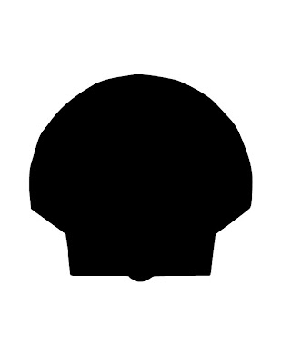
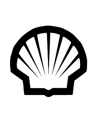
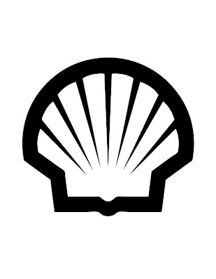
I've been working on my project for Color, Form, and Production tonight. Our first project involves messing around with logos that already exist. I choose to use the shell logo because it was simple and I am still new to illustrator. I have been working with the Pen Tool and Live trace. I'm starting to get used to the Pen Tool, but some of its quirky shenanigans are trying to test me. We had to trace the outside parameter of our logos with the Pen Tool and fill that in with black. We then had to trace to interior space with the Pen Tool and fill it in with white to create our black and white vector versions of our logos.
The second part of the homework was to start over but instead of using the Pen Tool we had to do a live trace. The vector trace that it produced was spot on but I ran into a couple of problems. When I did the live trace the vector image went on top on the template instead of going into the second layer and I cannot figure out how to stop this from happening. Also the live trace made a perfect replica of the logo the first time, so I do not have any points to fix which means I do not have anything to do for the final homework file. The final file was to fix any errors that the live trace made.
The first image included in this post is of the initial Pen Tool outlining Fill. The final Pen Tool and Live Trace images are next to each other to show the differences between the two and to show the progression and process I took.


Typo, Can I get an "a"


Three years ago I bought a vinyl version of Led Zeppelin's compilation album Mothership. The quality of the product and the beauty of its packaging affected me greatly. The thought that went into its packaging design as well as the care put in producing an album cover that truly captured the essence of Zeppelin grabbed my attention and made me think. It pushed me to immediately started drawing. After taking art classes in high school I decided to go to art school instead of majoring in mathematics. Sorry Mom.
During my first year at the Kansas City Art Institute I found a new love. Posters. The way the colors, images, and words all mingle together can be described as nothing short of magical. Off to Graphic Design I went. I'm currently in my first week of design and I am learning the basics of design. Whew. I'm glad because I do not really know anything about design essentials or the computer programs used.
My first class was Form, Color, and Production which is giving me the tools I need to start designing. Pictures of what I have been doing in that class will be posted later tonight. My second class was typography. I know most people would probably stab their eye out before taking a class about fonts but I love the little differences betweens fonts that give them their personality. Plus learning all the terminology for typography suits my nerdy side just perfectly. Though next class I need to remember to bring a pencil. Drawing the letter "a" with pen is horrible. My last class was Visual Communication. We are being taught how to break down concepts abstractly to find their essential meaning and how to display these meaning visually and in many different ways.