Today saw the completion of my book Ecumenopolis. Dot compositions were used to tell my story of urban dystopia. Creating and giving meaning to dots can be accomplished by using principles of design. The principles I used for each page were:
Congestion: Alignment, Repetition, Asymmetry, Continuation, Proximity, Compound Shape
Deterioration: Continuation, Correspondence
Polluted: Compound Shape, Correspondence, Proximity, Repetition
Anonymity: Proximity, Repetition, Correspondence, Alignment
Hunger: Alignment, Proximity, Positive & Negative
Isolation: Asymmetry, Scale, Framing
Accidentally didn't take a picture of this page. I will upload one when I get my book back.
Inequality: Asymmetry, Correspondence, Proximity
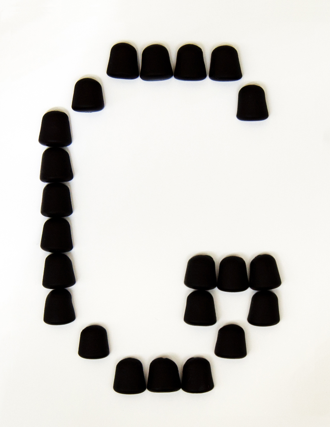
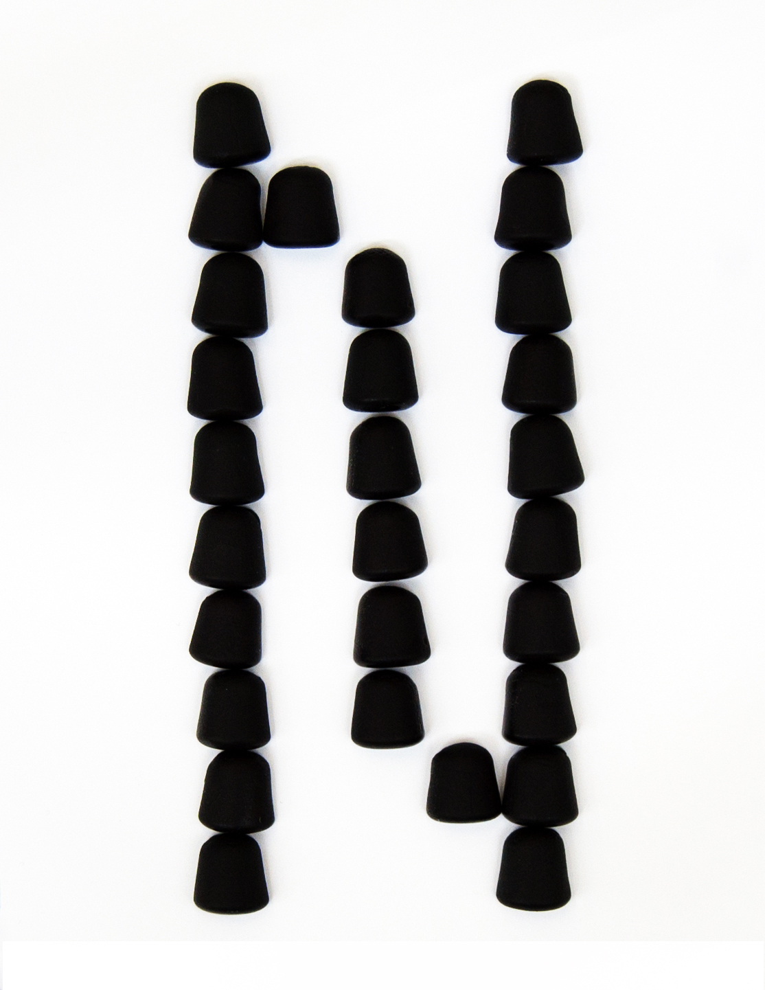
Panic: Alignment, Continuation, Scale, Repetition, Layers, Correspondence
Pictured Below
Violence: Asymmetry, Scale, Continuation, Proximity, Repetition, Correspondence, Layers, Positive & Negative
Pictured Below
Throughout the process of creating this book I viewed the dots as more than just design elements to create a composition. My view of the book was that of a play. I created my characters and cast them into their roles. By humanizing the dots I was trying to get at the raw emotions that I believe would be crucial for convincing the viewer of the sincerity and true essences of the words I was creating around.
My choice of images and material were chosen to aid the compositions in conveying what I believe to be the feeling of dystopic urban culture. Dark gray was chosen for my pages because of its cultural connotations as being gloomy. My images was chosen based on the words but they all have a fuzzy visual connection. These fuzzy images, especially of the people, were used so that the viewer would instead of looking for discernible subjects would be forced to feel what I was trying to convey through the compositions.
Another reoccurring element in my book is the use of black smudges around mask circles that I then removed and spray fixed to preserve my craft. Instead of using charcoal, which can be near impossible to erase, I used crushed ash from my tobacco pipe. I found the ash to easily removable and it went on very lightly but was able to build up to darker tones. The smell of the ash, which is not noticeable unless you put your nose up to the page, gives the book a charred, smokey smell which adds to the theme of urban dystopia, which wouldn't smell very fresh. The use of the same page color, fuzzy images, and smudge marks works to unite the book as a cohesive artifact.
I would improve the binding if I had a chance. I got the test pages to be exactly centered but whenever I put a transparency or the backboard through it would move the holes up. After the first time it did this I checked the alignment again with a test sheet and it punched the holes perfectly, so putting anything through thicker than a piece of paper must have caused the movement. The edges of the book are fine and there are not any half holes on the top or bottom. The holes on the pages also align correctly so there are no pages that hang out on their own.
I waited until right before binding the book to overlay the text pages on top of the dot compositions. I was afraid that the overlay might distract, take away from the compositions, or be illegible on top on the dots. I was was glad to find that the text not only worked on top of the pages but it also pushed the compositions towards the true essence of the theme.