
Friday, October 29, 2010
Paula Scher
Paula Scher is a graphic designer that moved to New York during the 1970's. She believes that living in NYC has influenced her graphic design aesthetic. She makes posters that show the personality and distinctive qualities of the city. With this project the concept was the same. We had to create posters for areas of Kansas City that would act not only as advertisements for the areas but they had to relate to the areas in context and have the essence it.
Thursday, October 28, 2010
Posters Galore
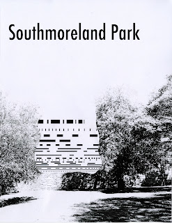
This week saw the conclusion of the poster project for Visual Communication. These final posters saw me go full color bleed. This choice was heavily influenced by the swiss material that I have been researching in typography. I chose to use popping yellow and black for the Nelson-Atkins poster because I wanted to bring the modern vibe that is found inside the Bloch building into my poster.
Using such powerful colors for the Southmoreland Park posters wouldn't have been in the correct context but I still wanted them to go along with each other. I did this by sticking with the two tone color palette with black but I used a creamier yellow to have a more naturalistic feel. Cream is also nice because it can go with a lot of other colors in cohesion. I also changed the typeface on the Southmoreland Park poster to Futura Std like the Nelson poster because the serif typefaces weren't catching the essence of the park. Futura Std ended up working for the poster because the typeface is round enough that it can still appear to be playful and airy.
I created depth in my Nelson poster with the angle that comes towards the corner. It causes the poster to recede into space. The poster for Southmoreland has the pile of dirt and line manipulations in the foreground of the poster. As you get closer there is depth to be found in the pile created by the overlapping in the collage phase. This poster connects to the general upkeep of the park. The pile of dirt relates to the piles of trash that can be found in the park after a freshman party. The Nelson poster is representative of the modern art period through its simplicity, composition, and colors. Throughout the project I worked on each poster idea as a collage first and then edited them after scanning them at high resolution. I found it easier to get my thoughts out with the paper cutouts then I did on the computer.


Final Monogram and Cobalt Spreads
Throughout this project we have been learning about monogram development and gridded page spread design. While looking online for my find and share I stumbled across a website that ended up being a wonderful source for page spreads from the early days of swiss design to the modern day. It has 711 different stories that tell the development of influential book design starting around the 1920's. Each story has lots of pictures of spreads and the use of grids is shown in great detail. The title of my project was causing me problems because the length was awkward for capitalization. Capitalizing each word made the title appear blocky and clunky. Not capitalizing any of the words made the title seem unimportant. I also tried capitalizing only the first word and what I believed to be the most important words in the title. By doing this I was able to balance out the title's strength.
The website:
http://wiedler.ch/felix/books/index


The website:
http://wiedler.ch/felix/books/index


Monday, October 25, 2010
Neue Grafik

This contents page from the September 1958 issue of Neue Grafik is my find and share to show grids in use. This page shows the influence of Swiss design in the late 50's and is based on a four column grid. The use of asymmetric layout and sans-serif typefaces was contributed by the swiss designers but the systematic grid was one of their most prominently used tools. On this page the title, the 1, and the farthest left column are aligned. This L-shape that they create is hugging the body text, which forms a square shape. This interactive and interlocking layout creates a sense of unison between the two basic shapes. This occurs even though there is a large scale change between the title and the body text.
This is Your Nelson-Atkins on Color.


As I have started to add color to my posters I have been messing around with the idea of 3D glasses like coloring or at least the effect of offset coloring. This is working for the Nelson–Atkins poster set but the Southmoreland Park posters have larger amounts of small information and color soon becomes overwhelming. Creating unison through the poster series with a cohesive color palette has become a priority of mine.
Thursday, October 21, 2010
Vector Vs. Bitmap
Vector and bitmap are two ways images can be displayed. Both of them have pros and cons. Vectors can be scaled up to very large sizes but they have a cartoonish appearance. These are good for billboards and sides of buses. Bitmap holds a lot depth as more detail is apparent. The problem is that these bitmap images can't be scaled past what their dpi allows. They start to deteriorate after this point. These different image types also carry with them certain styles. Vectors are very crisp with a smooth modern vibe. Bitmaps, since they contain more gradients and tones, appear to be softer.
Wednesday, October 20, 2010
Critique of Van Jumper (plus some Matt Jacobs)
1. My pairings are tied together in their relational comparison to each other. By making the blacks ultra-contrasted in my pieces of the Nelson I brought them together in a unifying way. One of my compositions of Southmoreland Park has a weak connection between the line study and the photo because the elements are not touching. Bringing them together could fix this.
2. My images are highly contrasted to give them interest. Pieces of the collage that are small loss some detail and they can be confusing to understand. Fixing the out lines of the pieces with large amount of white would help.
3. The line studies are well crafted for the sketches but for the posters they could be improved by vectorizing the projector and Konica studies.
4. The type needs to be integrated more in some of the studies. Placing the type in place of pieces of the line studies could fix their apparent disconnection from the posters.
5. Using scale, framing, orientation, and alignment I instilled dynamic qualities into the sketches. Throughout my pieces the use of orientation and scale is heavily relied on to create interest. Using continuation I tired to tie the photos and and line studies together. Moving compositions up in the page would create stronger pieces since some of them are cut almost in half, which has a static effect.
6. My sketches of the Nelson and the Southmoreland wall display qualities of the neighborhoods. With the Nelson the contrast of the line studies and the photo shows the contrast of the old Nelson building and the modern building. The wall of Southmoreland Park sketches show the feeling of containment felt while sitting in the park. The sketches that dealt with cracks in the dirt lost their connection with the Southmoreland Park because they show no special qualities of this specific park. This is because the pictures of the ground hold very little differentiating information.
My critique of Matt Jacobs posters:
1. I found strong relations within his pieces. The Midtown posters have great shape relation that ties the two elements together. The posters of Downtown could have more relating qualities. The windows have line studies within themselves that could be compared to a line study that is complex with smaller white lines.
2. The photographs that he used are shot with nice detail and from the perfect perspectives. The only photos that are not as strong are of the Bloch building. The photos appear to be vectors because the Bloch building is smooth and has no detail.
3. The line studies employ crisp, smooth vectors.
4. The "N" used in some of the Nelson posters intersects with the line studies. This was done purposefully but appears to be an accident. The typeface is a good fit for the Nelson, since it is modern yet elegant. Playing around with the placement of the text would cause it to become more cohesive with the posters.
5. Matt uses both large scale and small scale. In pieces where only small scale was used they appear to be static. His use of framing is spot on except in one poster where the shapes appear to be too large. This would be easily fixed by scaling down the shapes away from the edges. His alignment and orientation is heavily geometric with strong verticals and horizontals.
6. Matt conveys the feelings of his neighborhoods quite well. His posters of the Bloch building hold a modern clean feeling. Downtown is shown in undulating towers that are reminiscent of skyscrapers. Midtown is a neighborhood of different people and things coming together in a cohesive union. The posters Matt made are cohesive yet are made of elements that noticeably different.
Collages of Dirt and Stair Railings
I started the refinement and iterations of my posters using Illustrator. After attempts of masking using photos and the line studies I decided to switch to creating my posters analog and then taking them into the computer. I found the analog compositions easier not only in the matter of creating them but by having the pieces in hand I was able to flesh out my ideas more completely. Collages are still proving to be difficult for me but the newest set are a step up over the last. I looked to the Dadaists for examples of collage and their complicated work showed me how collages could be approached.


Monday, October 18, 2010
Blog Changes
Our current lesson in Color, Form, and Production has us working with the aesthetics of our blogs. Areas we are touching on include the headers, the color schemes, and the backgrounds.
My header has changed from a simple text and line header to now including a simple vector image of a person jumping over a van, which of course is a play on my name. The red highlight of the text Jumper is supposed to cause a tie to the red person jumping over the silhouetted bus.
My new backgrounds include a photo background and a tile background made of a squares that is repeated so that it appears to be one large piece.


Sunday, October 17, 2010
Crisp Cobalt
As I have been working on my monogram for Cobalt I have started to use a typeface called Foundry Gridnik. It is built out of rectangles and portrays my element's metallic nature and atomic build more realistically. Further research and planning for my monogram has included moving the lowercase o around. After working on this placement I moved onto trying to involve continuation. My idea was to have it so that the viewers mind would connect the lines for itself.
 |
| Some variations look like Cu as opposed to Co. |
I also built a electron cloud configuration for my image of Cobalt.

Cobalt was discovered in 1735 when a Swedish chemist was able to show that it was Cobalt that gave glass the blue color and not bismuth. The word cobalt comes format he German word for goblin and evidence of its use has been found in Egyptian, Persian, and Bronze Age cultures. Their use of the element included being ingredients in specialized paints, glass, glazes, and ceramics because of its deep rich blue color. The use of cobalt has changed in recent times and its uses now include being ingredient in batteries, pigments, radioisotopes, nuclear weapons, and acting as catalysts. Cobalt has still not been found in nature as a pure element and it is still obtained today as a by-product of nickel and copper mining.
Cobalt is necessary for life in tiny amounts, but prolonged exposure shows that cobalt can act as a carcinogen and handling is strongly advised against. This element belongs to the transition metals group, which gives it high melting and boiling points. This element is hard, brittle, and has a lustrous gray appearance. Cobalt is also found to be stable in the air and water. Cobalt can be magnetized and is chemically active, which causes it to form many compounds.
Thursday, October 14, 2010
Southmoreland Park and The Nelson-Atkins
This stage of the current project has been to find and photograph areas around Kansas City that have elements that match our studies that we have been creating for the past two weeks. At first this task seemed very complicated but soon after starting the search I found a lot of matches. The photographs were then paired with their counterparts. After revisions and switching around some elements we reached the current stage of this project. We had to use the line studies and photographs to create analog collages and we had to include the name of the area as text.


 |
| Compared to a bus. |

 |
| Compared to grate. |

 |
| Compared to railing and shadows. |

 |
| Compared to cracked dirt. |

 |
| Compared to tree. |

 |
| Compared to tree line. |

Cobalt Monograms
The current project in Typography has been working with element symbols and turning them into monograms. After doing research on the elements to find their histories and properties we had to create thirty sketches of monograms using our two letters that represent our element. From this we picked ten of them and corrected them so that they would be more refined. Again we chose the best ones, three this time, and we had to do five variations on it. The themes of my variations are Alloy, Magnetic, and Hexagonal. We had to use fonts that were in our font folio and I chose to use Avenir LT Std Light. Hexagonal wouldn't work with a typeface because of its weird shape so I had to create them myself. I chose to have the lines very thin because the element is extremely brittle. Given a choice I would have the other sets be this thin too.
 |
| Alloy |
 |
| Magnetic |
 |
| Hexagonal |
Tuesday, October 12, 2010
Text Image Juxtaposition Reading Responses
Like our current assignment the reading deals with the use of image. The use of modern technology has increased our ability to transform these images so that we may use them to say what we want them to convey. This could be done through tactics such as image alteration, exaggeration, or combination. Alteration is changing something so that it has characteristics that it used to lack. The use of exaggeration is like it sounds, the exaggeration of an image to say its meaning. Using image combination allows the design to compare and contrast images. An example technique of this being photomontage. Also discussed is the importance of camera angle, cropping, and viewpoint. These can change the power of a design from being either being static to highly dynamic. Graphic support images are used to back up the main images.
Unplanned juxtapositions can cause an array of different outcomes. An image of a poor child next to an ad of food products can cause an contrast of ideas to a distasteful extreme. While this is a possible outcome the other possibility is that the two juxtaposing images would enhance each others meanings by sharing a similar message. If a designer were to harness the power juxtaposition then he would gain a powerful tool, since he could then use it to make dynamic pieces with strong meanings.
Unplanned juxtapositions can cause an array of different outcomes. An image of a poor child next to an ad of food products can cause an contrast of ideas to a distasteful extreme. While this is a possible outcome the other possibility is that the two juxtaposing images would enhance each others meanings by sharing a similar message. If a designer were to harness the power juxtaposition then he would gain a powerful tool, since he could then use it to make dynamic pieces with strong meanings.
Sunday, October 10, 2010
A Tale of Colors
 |
| Through the title I was able to unite the pictures inside with a common theme. |
My book for color, form, and production has reached its completed state. All of the color studies were piles of clothing that were chosen so that the colors would become certain different color systems. The table of contents was kept simple but I included colorful dots next to their classifications to act like a small appetizer. The colors of the dots were the colors that I used in the book.

 |
| Warm and Cool |
 |
| Shade and Complimentary |
 |
| Split Complimentary and Triadic |
 |
| Square and Tetradic |
Wednesday, October 6, 2010
Historic Find and Share. #2
My historic find and share this week is a poster that advertised Geigy's pesticide product called Neocid. The poster is by Karl Gerstner. After researching the Geigy company I have found that their use of graphic design was influential in the progression of design history. Their clean swiss designs became quite popular and became widespread in use.
I like this poster because of the simplistic way it was executed. The horizontal white line, sandwiched between the two red planes, is crossed by a strong downward curve of dying ants. This use of basic underlying lines to create interesting compositions relates directly to what we are doing in class with our basic and complex line studies.

I like this poster because of the simplistic way it was executed. The horizontal white line, sandwiched between the two red planes, is crossed by a strong downward curve of dying ants. This use of basic underlying lines to create interesting compositions relates directly to what we are doing in class with our basic and complex line studies.

Final Dot Words
 |
| Sounds Delicious |
These are my final words made from Dot candies. While designing this font I found that it was very fun and yet challenging. Creating a cohesive font while trying to stay within the limitations that you set for yourself is like a visual puzzle. The littlest of changes can throw off the harmony of this project. I found that consistency and craft were key for being successful in this project.
Tuesday, October 5, 2010
The New Basics Reading
As we move out of the last project we are starting to learn about using other graphic elements besides dots. The use of line started off the new project as we learned about movement, depth, and time using linear elements. By manipulating the line so that it would have width we changed them into planes which have a characteristic of boldness and stability. These objects can be positioned so that they appear to move throughout space and this can give a design a depth of time and space. Planes and lines also create a sense of foreground and background, where one appears to lay on top of the other. it can also be made where neither field appears to be dominate. this can cause confusion but pulls the viewers eyes all over the design.
Compex, Angular, and Curvilinear
Continuing with partner collaborations, my partner and I have been working on complex, angular and curvilinear compositions.
My partner and I each did 15 complex studies and then we compared and critiqued them to find our best ones.


My partner and I each did 15 complex studies and then we compared and critiqued them to find our best ones.
 |
| Progression |
 |
| Regular |
My partner and I worked together for the experimental studies that involved the projector, the konica, and the flatbed scanner. I found that the projector was actually limiting on what could be done. The rooms had to be dark and coming up with creative things to do with it was challenging.


Corn Syrup!
After a small group critique on my letters made from Dot Candy, I went back to the third variation I had created and started to tweak it. I made the letters more consistent and I started to add personality to them by adding three dot slabs to them. Two sets on the uppercases and one set on the lower.
I started this process by first designing the letters in illustrator. The red dots denote the x-height.


I started this process by first designing the letters in illustrator. The red dots denote the x-height.


After finishing the initial designing process I moved on to photographing the letters. For this I used a tripod and grid for consistency. The photos were edited in photoshop so the grid wouldn't show.


After all of the letters were complete I used photoshop to put them together to create my words. My words are Sticky, multicolored, and Corn Syrup.

Subscribe to:
Comments (Atom)